
Building a shared product language
Reducing friction from design to production
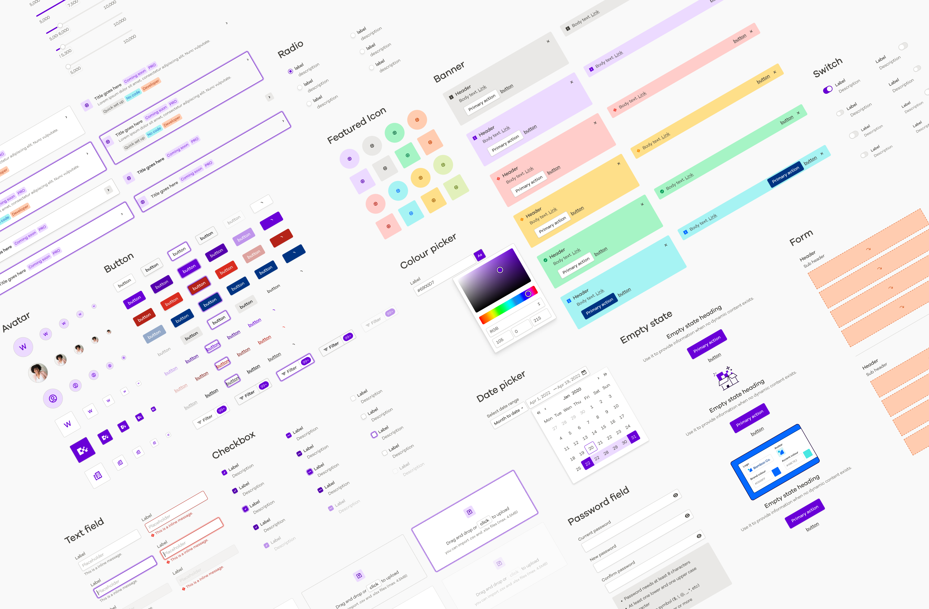
Pledge Product Language — PPL — established a shared design and engineering foundation across Pledge's products, connecting brand foundations, design tokens, reusable components, documentation and application interfaces.
It began as a move away from a restrictive third-party component library, but the ambition was broader: own the product language, keep design and implementation aligned, and create a themeable foundation for branded and white-labelled experiences.
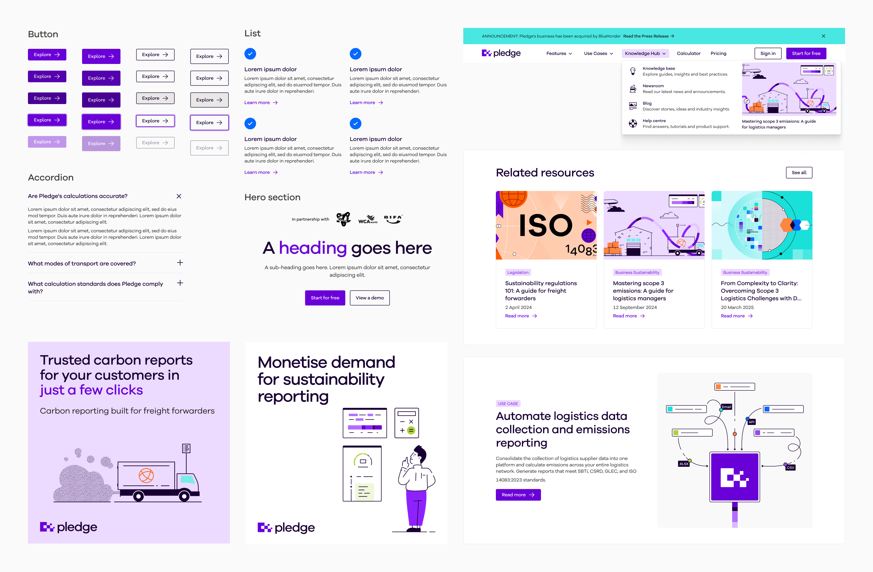
The same primitive foundations also underpinned Pledge's wider brand system, giving product and marketing a shared visual language.
Owning the product language
Pledge's interface was originally built using Ant Design. It accelerated early product development, but increasingly constrained how we could express the brand, customise interactions and support different themes.
Working around the library had also created duplicated styling across the client and admin applications, while design and implementation could drift apart.
Rather than continue adapting somebody else's system, we wanted to own our product language — creating foundations that could evolve beneath the product while teams continued shipping.
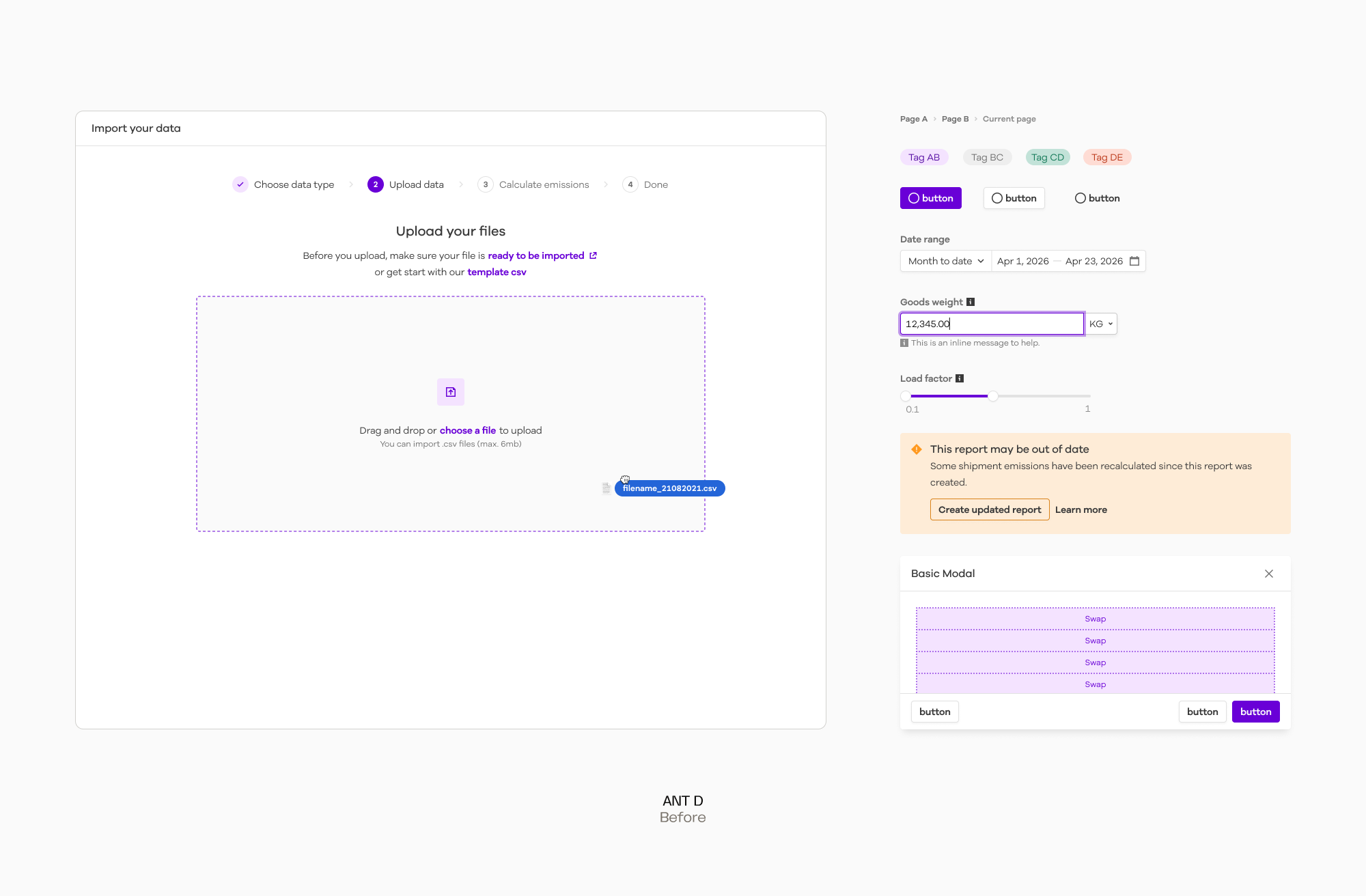
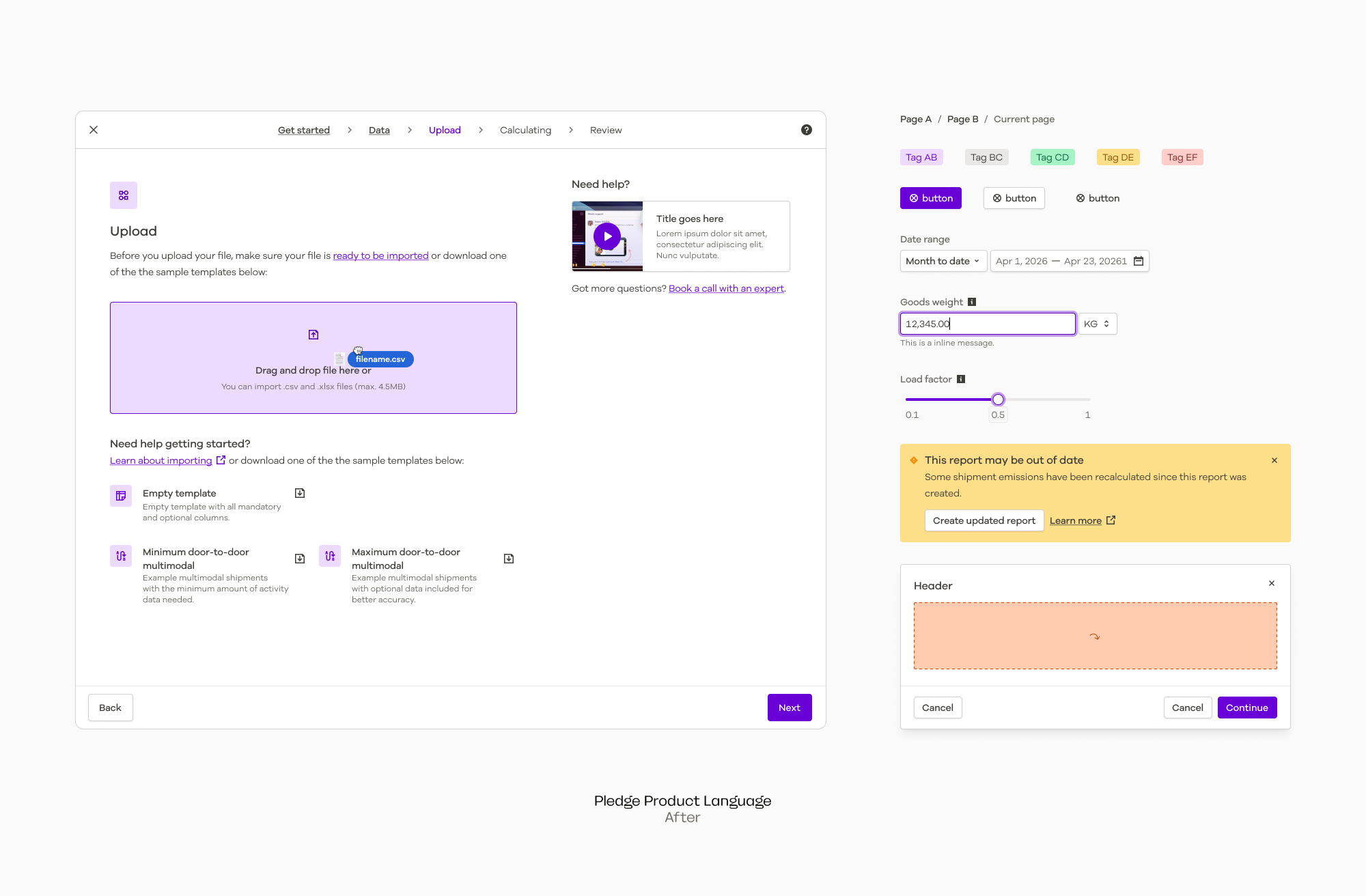
One foundation for brand and product
We deliberately started beneath the interface.
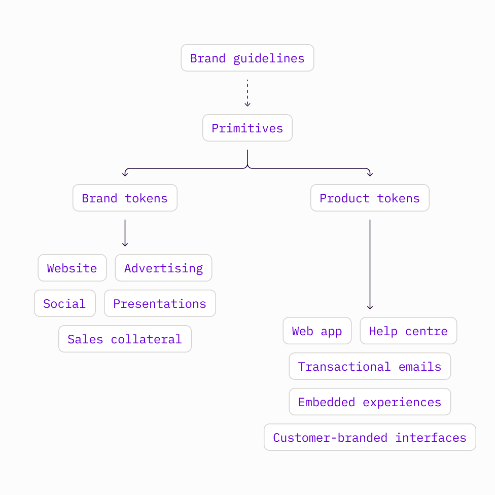
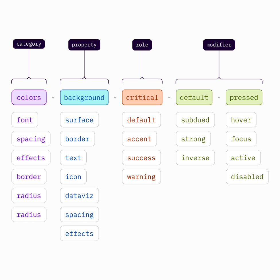
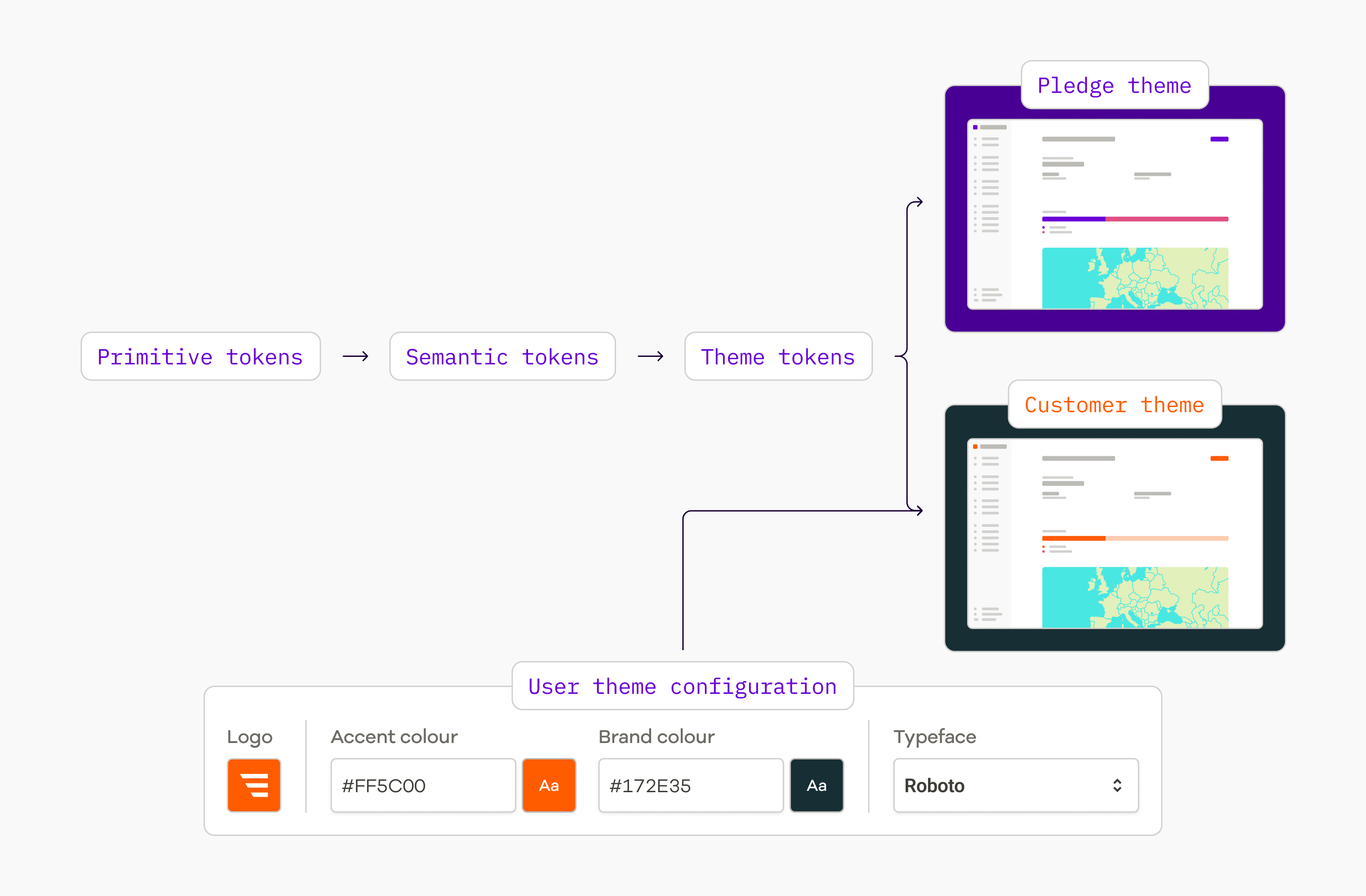
Primitive tokens defined the core ingredients of Pledge's visual language — colour, typography, spacing, radius, shadows and other foundational values.
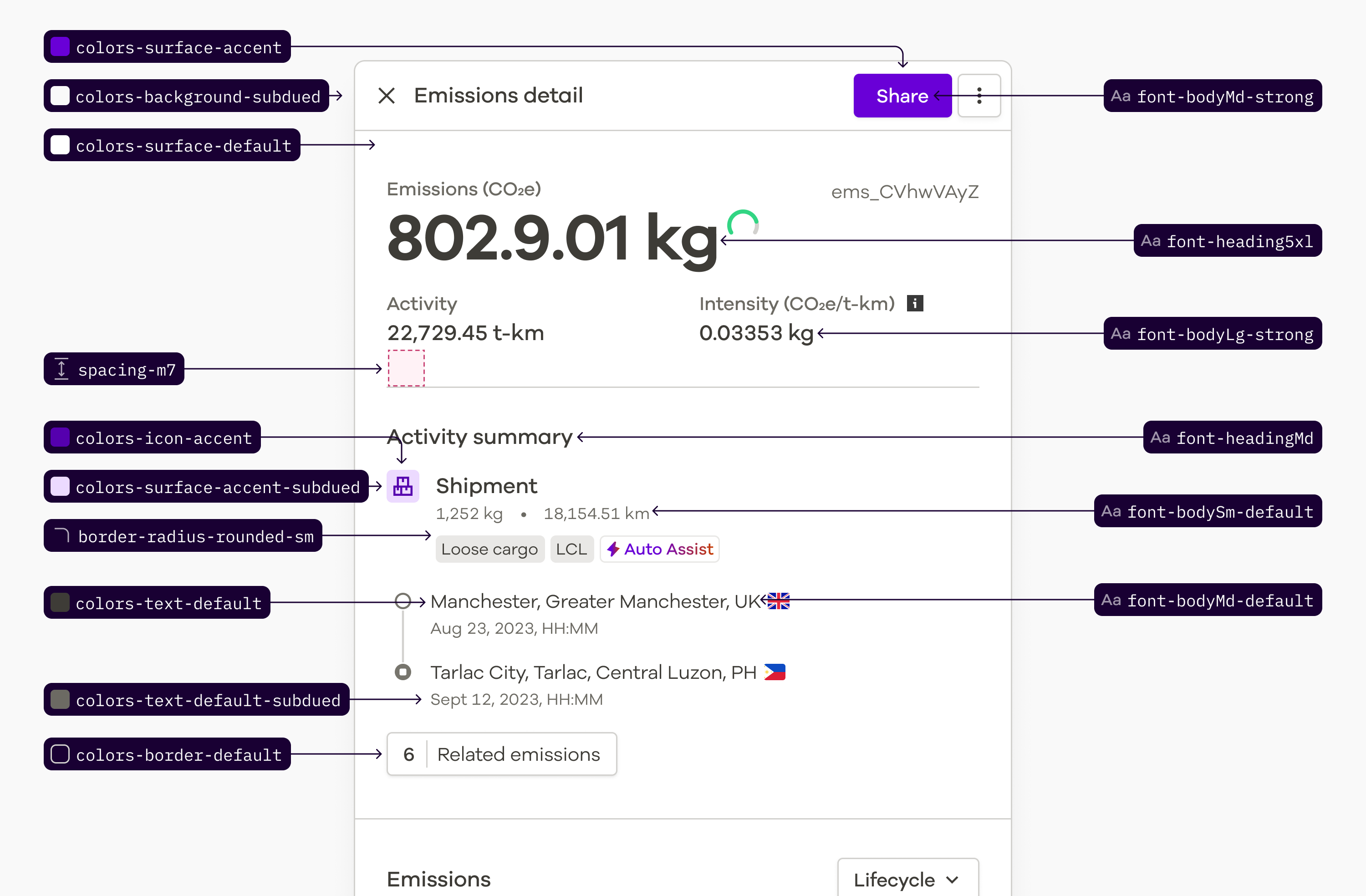
Product-level semantic tokens gave those foundations meaning within the interface, while the same primitives underpinned the wider brand system across marketing, communications and digital experiences.
This gave brand and product a common visual language without tightly coupling them together: each could evolve for its own context while continuing to share the same foundations.
Building a reusable product language
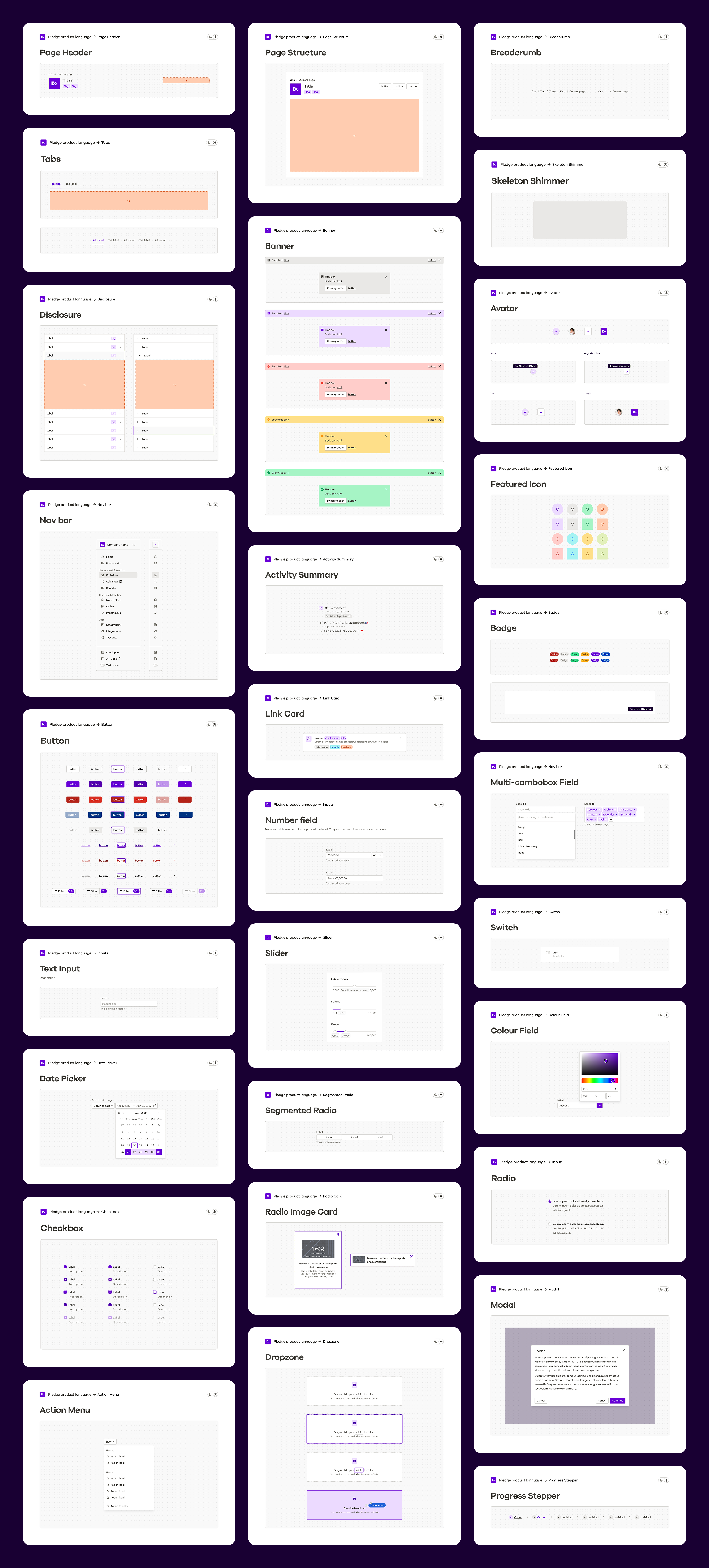
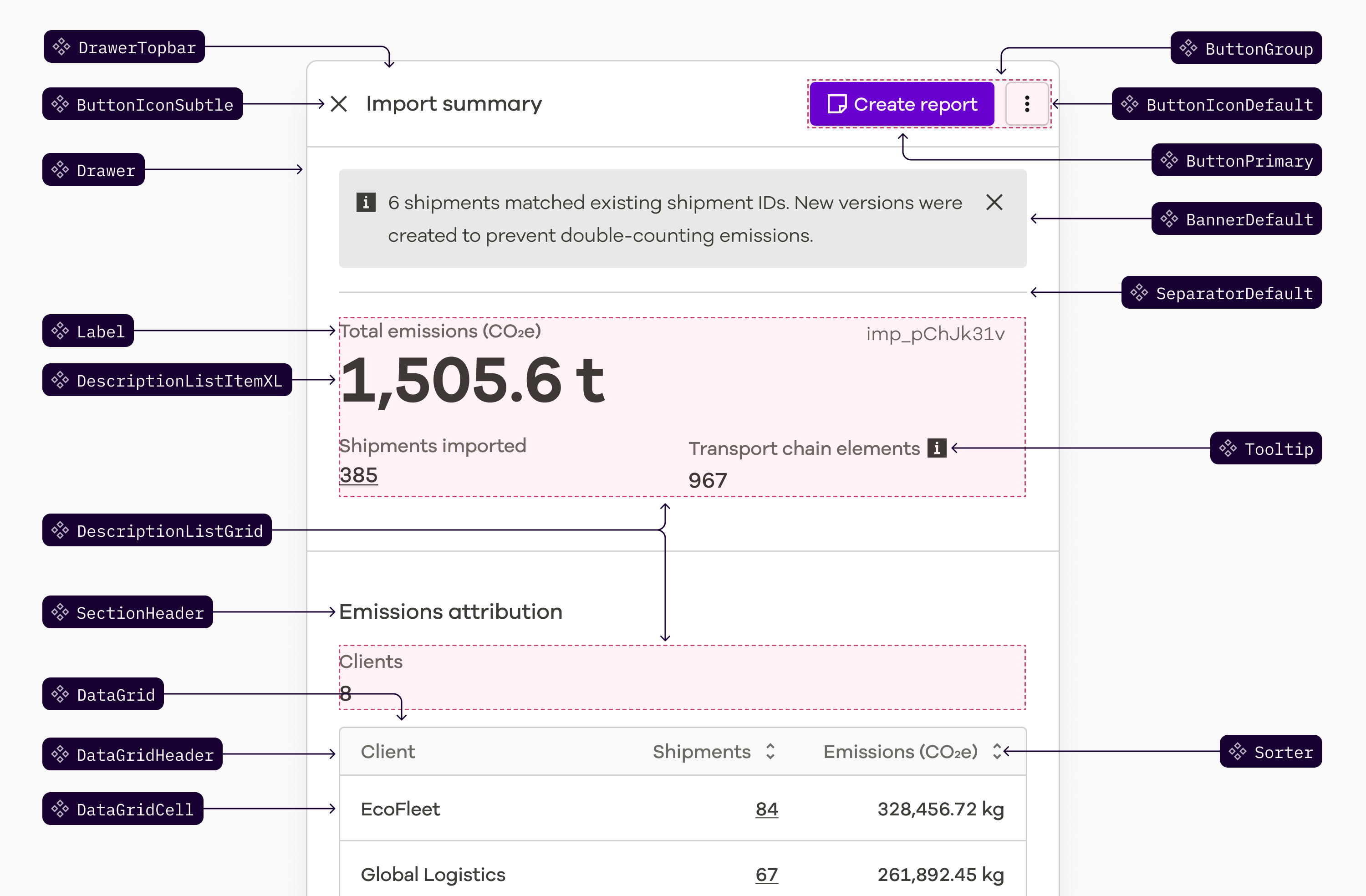
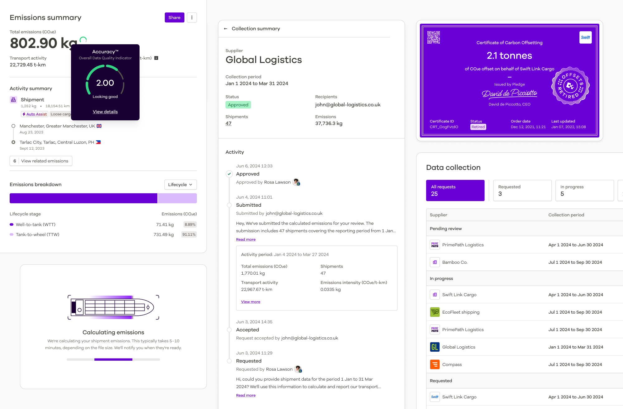
On top of those foundations, we built reusable components for the patterns repeated throughout the product — inputs, selects, comboboxes, tables, navigation, drawers, tabs, badges, menus and more.
We also standardised broader application patterns such as sidebars, headers, page structures and responsive spacing.
The aim wasn't simply to create a component library. It was to give teams a shared vocabulary for assembling product experiences from known, reusable parts rather than solving the same interface problems repeatedly.
Connecting design and code
A shared product language only works if its design and engineering implementations stay connected.
We evaluated headless libraries including React Aria and Radix, looking for established interaction
behaviour without inheriting another visual language. PPL ultimately adopted
react-aria-components as part of its foundation.
The library was packaged through npm with its own publishing pipeline and versioned releases, allowing both Pledge applications to consume the same components.
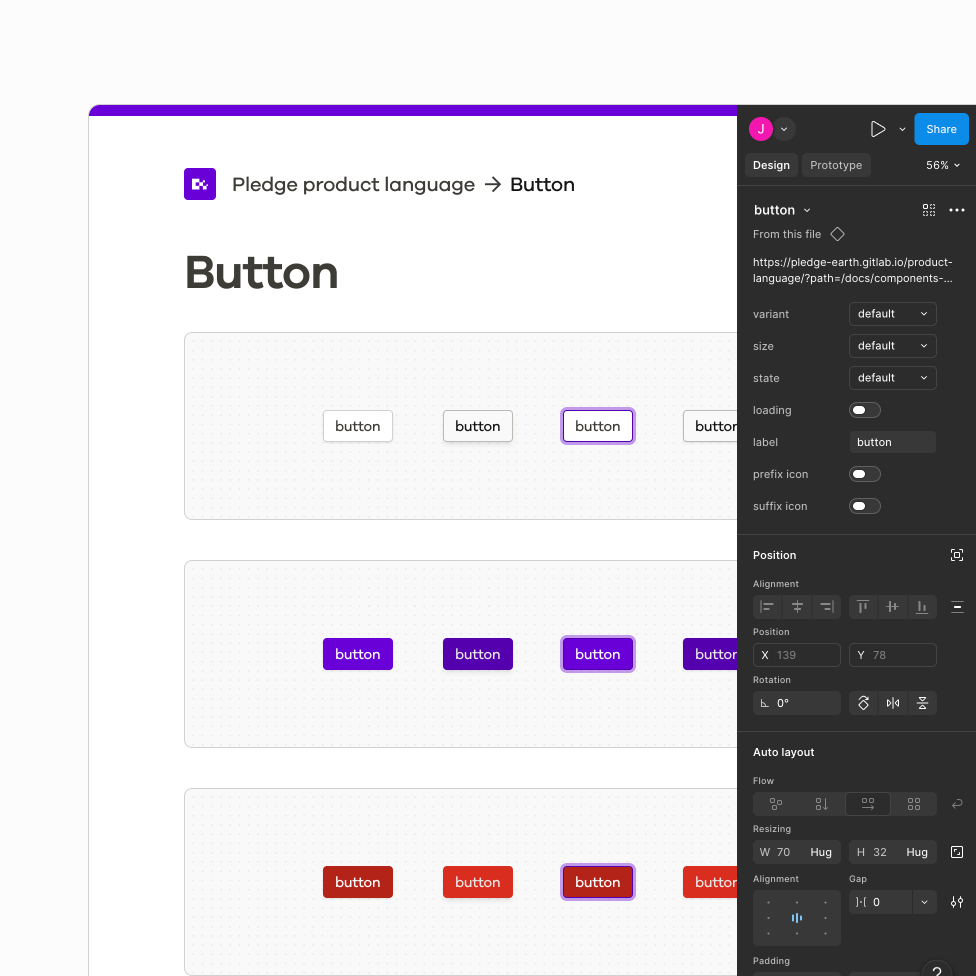
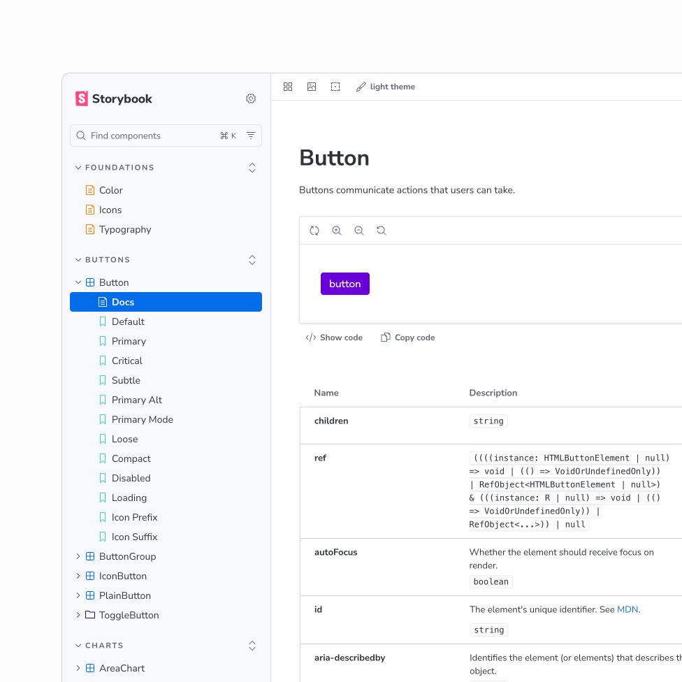
Figma variables connected design decisions to the component theme, while Storybook documented variants and properties alongside their design source. Code Connect strengthened that relationship further.
The principle was simple: the component a designer used in Figma should represent the component an engineer used in production.
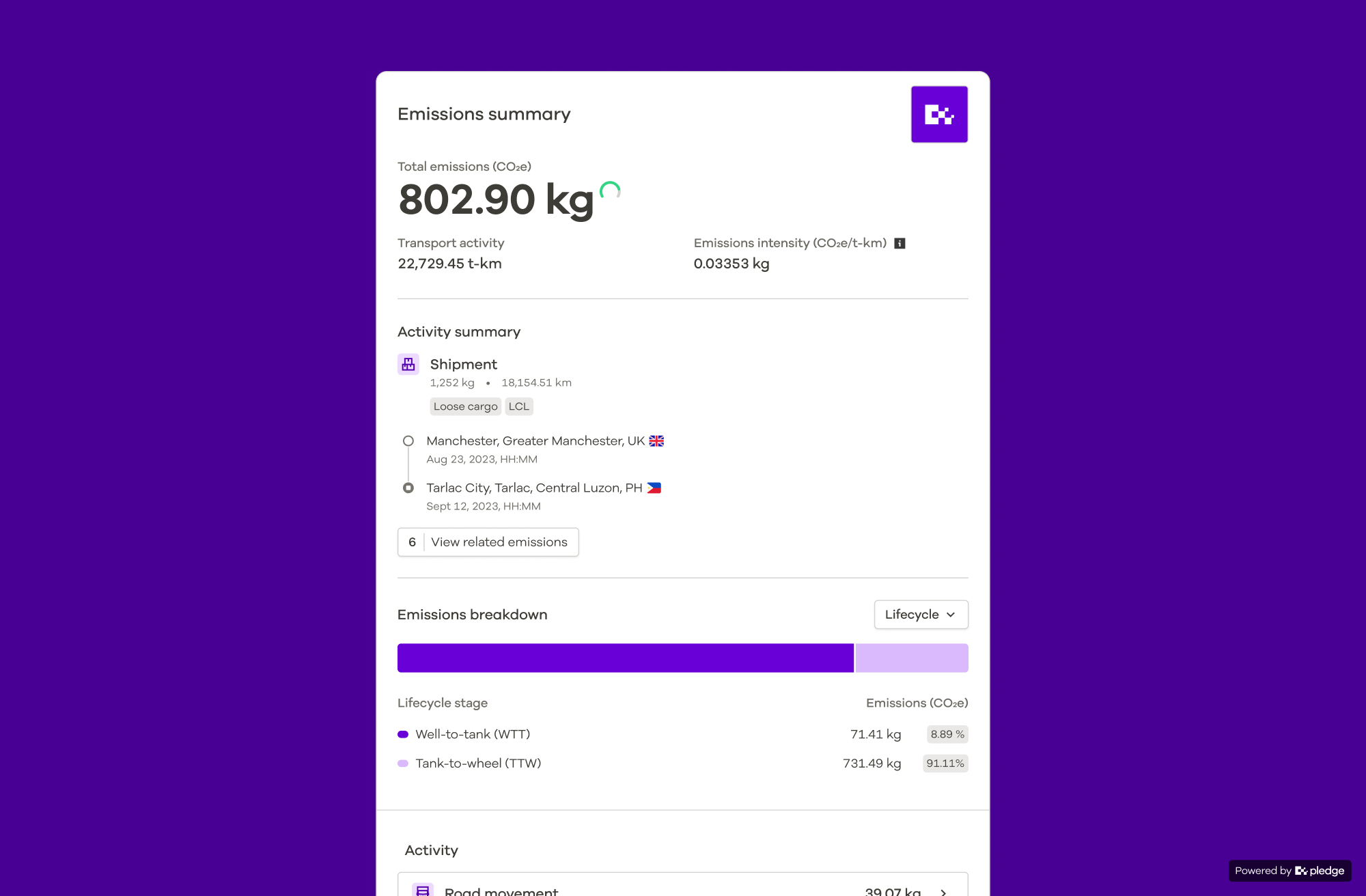
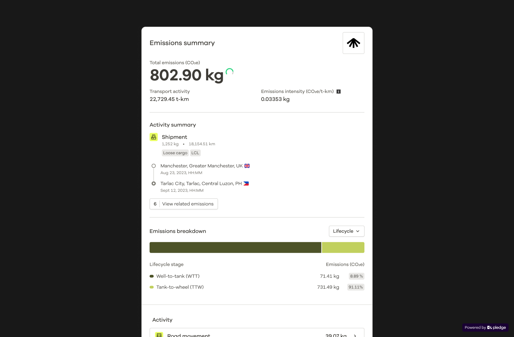
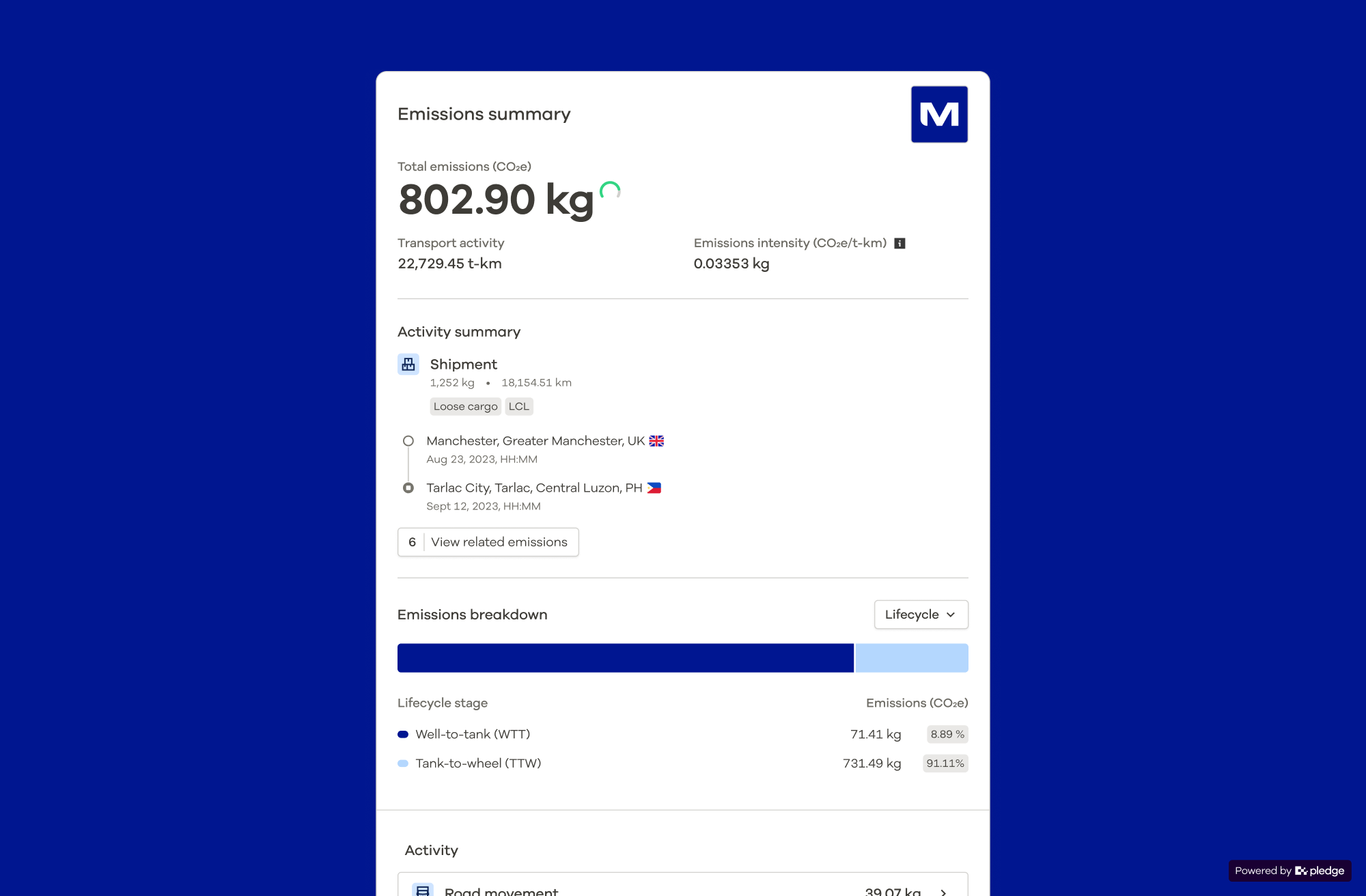
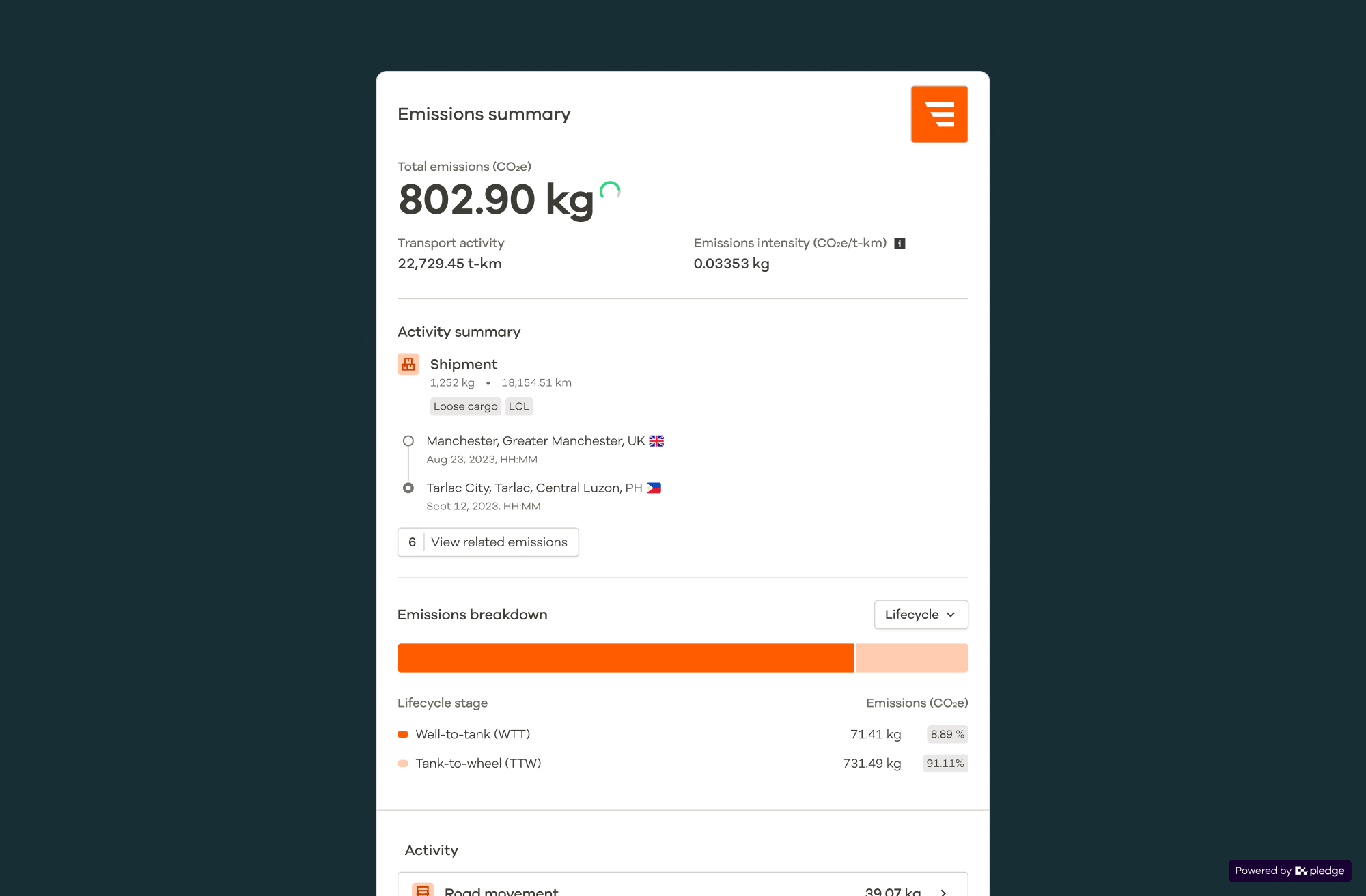
Designing for themes, not a single brand
A major driver for owning the component library was separating how the product worked from how it looked.
Components could retain the same structure and interaction while themes and semantic tokens controlled their visual expression.
That opened up a product opportunity as well as a design-system one. Customer branding and white-labelling could become add-on capabilities without maintaining separate versions of the application.
Pledge itself was no longer baked into the components — it became one possible expression of the system.
Migrating without stopping the product
Replacing an established component library couldn't happen as a single redesign.
We treated adoption as part of component delivery. A component wasn't finished because it existed in PPL; it needed to work within real product experiences.
Components were progressively introduced across forms, reports, imports, emissions views, billing and operational tooling in both the client and admin applications.
Larger areas such as tables, forms and layouts were broken into smaller migrations so product development could continue alongside the work.
At the same time, legacy SCSS variables and hardcoded styles were replaced with shared tokens, obsolete utilities were removed and dependency on Ant Design was progressively reduced.
Proving the theme architecture
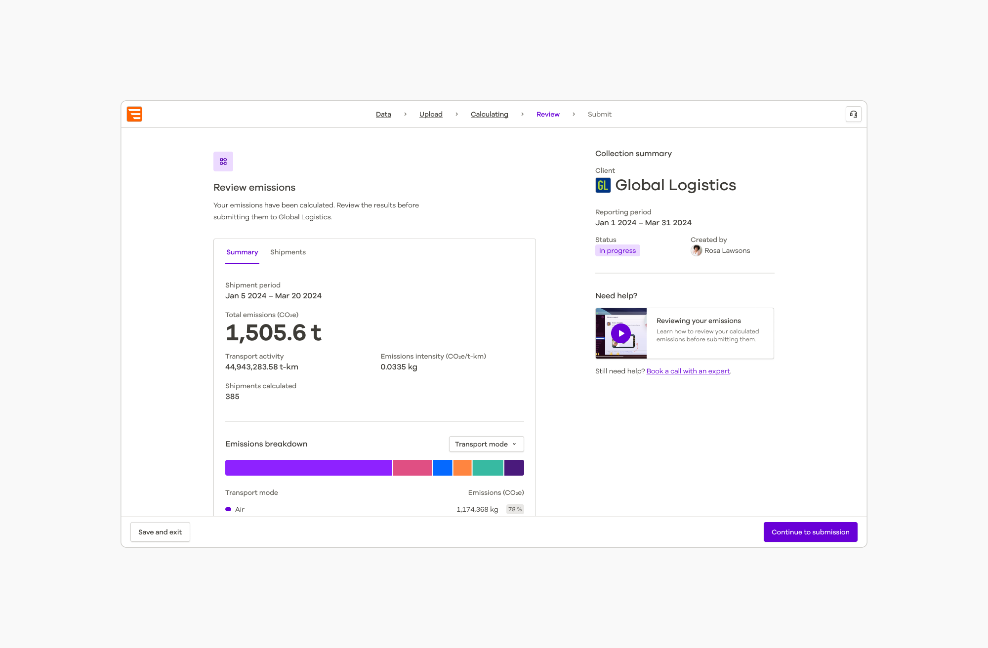
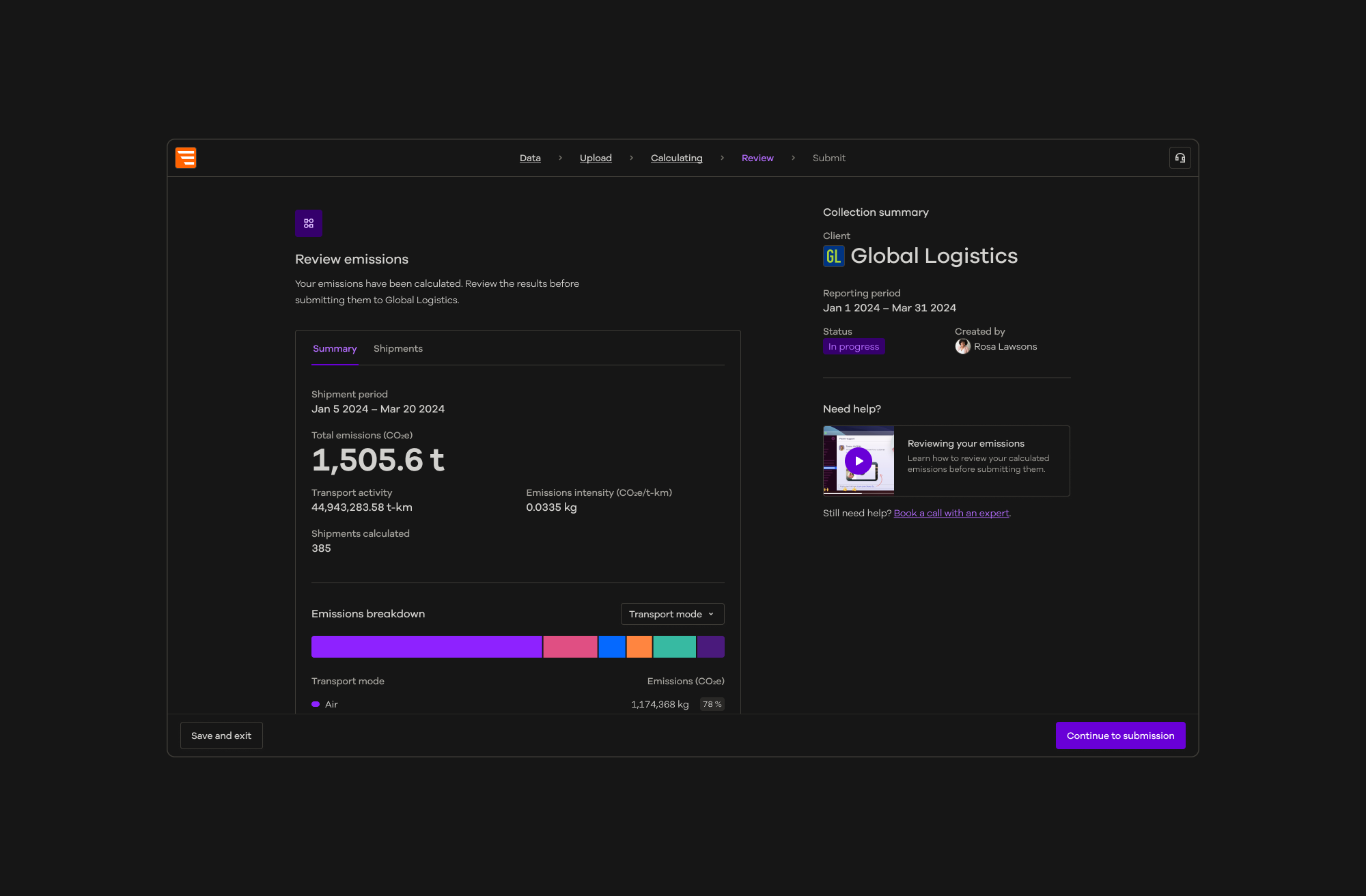
Dark mode became one of the clearest demonstrations of the new foundation.
Rather than designing and maintaining a separate interface, the existing product could respond to a theme through its semantic tokens and component foundations.
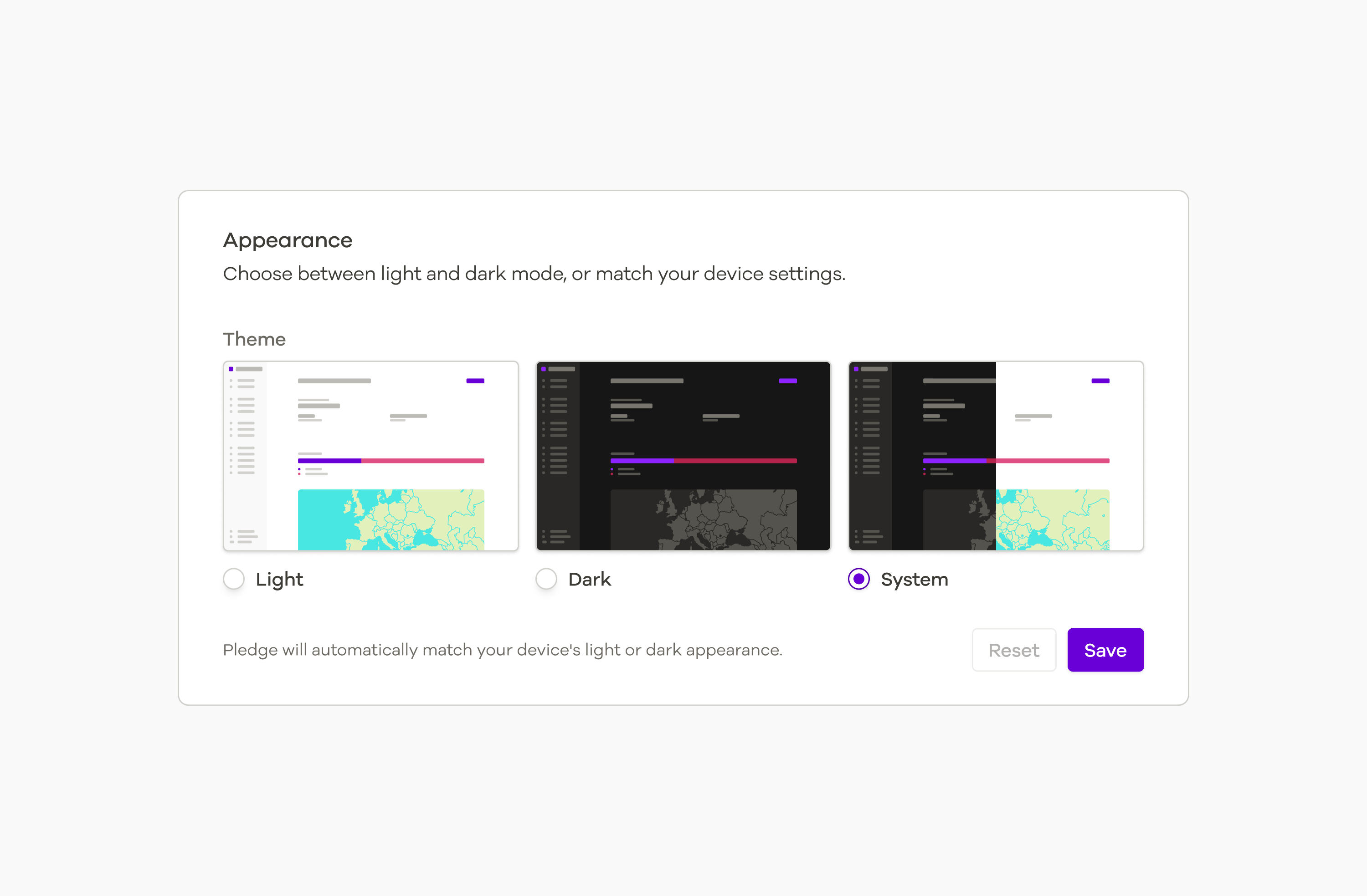
We introduced Light, Dark and System preferences and refined components and application surfaces to work consistently across each.
The same architecture designed for customer theming was now supporting another substantial visual change without creating a second product experience.
Evolving the whole brand
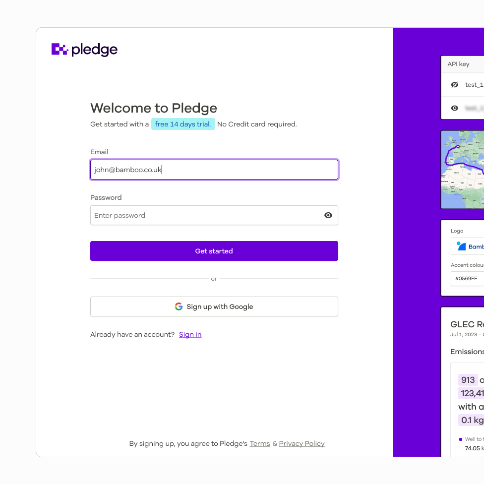
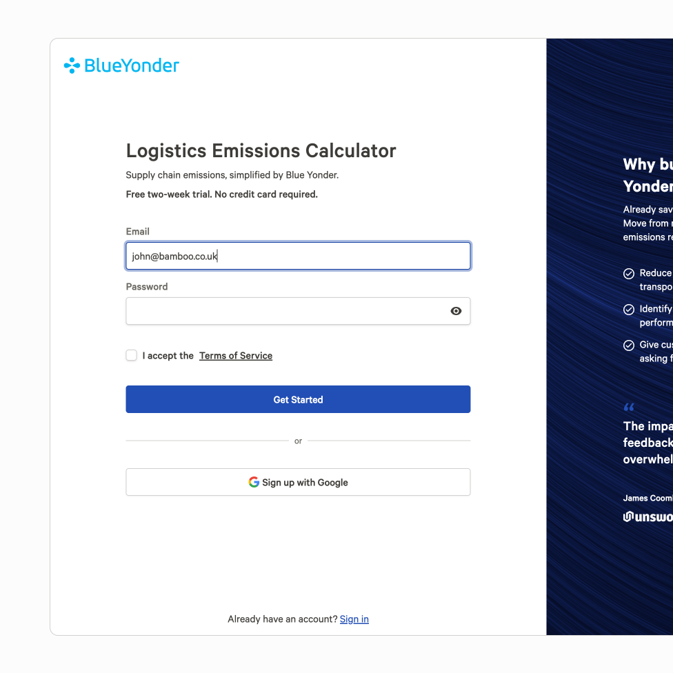
PPL was tested again when Pledge became part of Blue Yonder.
The transition went beyond changing a few product colours. We updated colour and typography foundations and carried those decisions through Figma, Storybook, the component library and both applications.
Because structure and interaction were separated from visual expression, the existing product language could adopt a new parent brand without rebuilding its components or interfaces from scratch.
It was a practical demonstration of why the underlying architecture mattered: the brand could change while the product system remained intact.
A foundation that kept evolving
PPL continued beyond the original migration.
New requirements introduced expandable modal drawers, richer banners, resettable selects, grouped toggle controls, chart components and ongoing improvements to existing patterns. Theme tokens, documentation and package management continued to evolve alongside the product.
Not every legacy dependency disappeared as part of the original work — nor did PPL need to become a finished, static system.
The more meaningful outcome was the foundation itself.
Shared design decisions became reusable foundations. Those foundations connected brand and product, became production components, and supported experiences that could evolve without redesigning the system each time.
Dark mode, customer theming and the later Blue Yonder transition showed that PPL had become more than a component-library migration. It had become infrastructure for how the product and brand could continue to evolve.